
TALISMAN COVER ARTIST, RALPH HORSLEY, TELLS US ALL ABOUT COVERING A CLASSIC
Ralph Horsley has been working as a freelance illustrator within the games industry for over a decade. He says he gets huge satisfaction from creating images of worlds inhabited by a motley array of gritty and dramatic characters. WFRP fans may remember his work from the Hogshead edition of the game, and his great covers for Realms of Sorcery and the Tome of Corruption.
When not toiling at the drawing board he can be found playing games (roleplaying, board, card, or tabletop), model making, listening to music, or simply enjoying a pint. Check out Ralphs website to see more of his work. A Desktop Wallpaper of the cover art is available online.
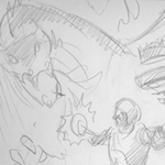
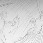
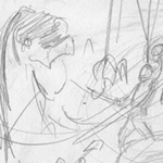
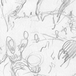
Click on each of the images for a bigger picture of the cover or concept.
 |
 |
 |
 |
 |
 |
 |
 |
 |
 |
Working on any cover image is an involved process. I was presented with a brief that outlined the key elements that were required. The game centres on a race for the Crown of Command, which is found in the Valley of Fire guarded by a huge Dragon. The characters can ward themselves from the Dragons attacks by the use of a talisman. Whilst other pitfalls and monsters befall the characters on their quest it was decided that depicting them would just add clutter to the cover.
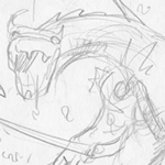
It was decided that the focus should be upon a warrior about to seize the Crown, but who must first tackle the final opposition of the dragon with the use of his talisman. I prepared a number of compositional sketches. These are quick representations that are intended to show the different approaches that might be taken. They allow for experimentation with point of view, perspective and the like but are not overly concerned with detail.
In one of them I tried out the concept of a spiral staircase. I felt this helped convey the concept of climbing to reach a goal, enabled the Crown to be placed clearly on a pedestal, gave scope for interaction between the different characters and enabled the Dragon to loom over the whole.
I had already had comprehensive discussions about the look of the image. It was decided that this 4th Edition should refer back to the 2nd edition in subscribing to clear fantasy archetypes that stood apart from the clearly delineated world of Warhammer but that would hopefully feel more contemporary and a bit grittier. I took the basic design on the dragon from the previous box cover and tried to push it into meaner, nastier territory. Likewise whilst the costuming of the characters echoes that of the previous edition they were elaborated upon and expanded. A nod in that direction was good but we were not seeking to imitate.
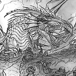
The cover sketch took me about a week to complete and the Art director duly reviewed it. I was very happy that the requested tweaks were pretty minor. For example, an adjustment of the Dwarfs armour to make it chunkier, and a slight revision of the thiefs face to capture the right expression.
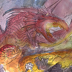
I then worked up a simple colour rough. This was a wash lightly applied over a print out of the sketch. The intention here is simply to show the predominant colours and where light sources are focused. Overall colour can make a big difference in impression whilst lighting adds mood and can focus the viewers attention. The brightest light source would be the Talisman, with additional moody lighting and colour provided by the flickering flames from the valley floor.
With all this approved I embarked on the actual painting itself. I tend to work from back to front. That is the apparent furthest point away to the nearest. This helps me to keep the colour and value balance how I want it. The objects in the foreground want to have darker shadows and stronger contrast so as to pop out from the background and be clearer to read. I painted all the background first so as to maintain the unity I wanted and so that it would be easier to develop the characters within that context rather than as I went along.
I paint using acrylics. It is a flexible medium that can be diluted to perform almost as watercolours or left more opaque to give a very solid colour. I tend to lay down an underlying wash which is built up to provide the darkest shadows before adding the highlights with a more opaque finish.
At this point I submitted a scan of the work in progress to the Art Director. This was important just to check that we were still heading in the same direction and that the painting was tying in to the colour rough. Fortunately this was only a formality and I happily continued with the detail of the characters.
Having the context of the background around the figures allowed me to bring some of the adjoining colours in to them. The most obvious example is the reflections and colours on the warriors armour but also more subtle shades that might exist in the shadows. This all helps unify the image.
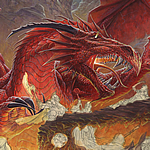
I spent about two weeks working the painting up to its final stage, which was once again submitted for approval. It was decided on a further couple of tweaks. The Dragons eye was the most obvious. My initial thought was that the Crown, Talisman and Dragons eye should all have a glint on them. I had thought this would help reinforce their connections visually. However it was decided that this detracted from the menace and focus of the Dragon and so it got its evil black eye.
Working on this cover artwork was a complex task, there already existed three different published interpretations and I was required to envisage a fourth which acknowledged that history. A large number of elements needed to be incorporated into the picture whilst still retaining an initially striking impression. Plus all this needs to be done within the context of the Art Directors own vision and that of her production team.
As this cover was completed I then began work on the board artwork. This brought about its own distinct challenges but also the ability to link it in directly with the imagery and palette of the cover. I have found this project absorbing, challenging and ultimately satisfying as I have seen it develop, evolve and finally be completed.


